
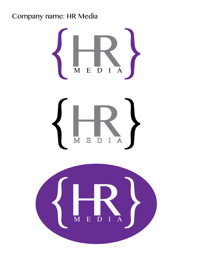
- Description: Logo for a company
- Process (Programs, Tools, Skills): I created this in Adobe Illustrator. I had a really fun time figuring things out, since this is the first time I’ve used Illustrator. I used the type tool to create all the different aspects of the logo itself. By using different sized fonts and variations on leading and kearning, I was able to make the text fit a certain way, with MEDIA spanning across the connected HR. In the case of the bottom logo, I used a simple ellipse tool to create the background and just made the font white.
- Message: Of all the drafts I had, chose this design because it gives a message of professionalism. It is clean and just breathes.
- Audience: Customers looking for media her from this company.
- Top Thing Learned: The type window, including leading, kearning, and sizing.
- Color Scheme and Color Names: Monochromatic purple. Purple, Gray and Black.
- Title / Body Font Names & Categories: Bangla, Sans Serif. Times Roman, Serif. (For the brackets: Noteworthy, Sans Serif)

I really like how simple this design is. I mean, it’s simple, but it still looks professional and really well done. I love the colors and how the H and R mesh together. I love it all! I was trying to go for simple yet professional look on my own design. Check it out! https://mkdotson.wordpress.com/2015/10/31/progect-5-logos/
Hey! Your project is really cool! I like how simple it is and that you used the curly braces to bring it together. I also like the different color schemes and fonts that you used. Good job!
here is another one: https://trufflelily.wordpress.com/2015/10/31/project-5-logos/comment-page-1/
(This was actually Alex Macfarlane, she was logged into my account lol)